Research
Understanding the problem
Method: Survey
We surveyed a sample size of 13 pet owners to determine if we are addressing a valid concern. We also surveyed 5 veterinary nurses to get an insight on their professional POV. We sampled their various thoughts, behaviors, and values towards their habits when dealing with their pet's overall health, followed with another round of interviews to pinpoint their troubles.

Insight
When interviewing the vet nurses we delved deeper into their pain points and challenges as service providers. The interview and survey revealed significant gaps in the current system when it came to delivering and receiving medical documentation. They emphasized their need for a platform to facilitate communication between clinics and clients.
"Our systems are outdated. If we need to retrieve old medical files from a pet's previous clinic, we have to contact that clinic and at times fill out a form to get authorization for those records. The entire process can take a couple of minutes to a few day, and in cases where it's an emergency we don't have time to wait for them." - Mary M.
Pain points
Method: Interview
Based off of our survey we conducted user interviews with 6 out of the 13 pet owners from the survey. The objective was to identify common pain points and understand the user needs within the problem space.
Questions
1. Do you keep track of your pets' medical records, and if so, how?
2. What is your thought process when dealing with these documents?
3. What are your main concerns regarding your pet(s)' health?
4. What features would you like to see in a medical app for your pet(s)?
Findings
When it comes to organizing their pet’s medical records, convenience is a main factor followed by accessibility.
All interviewees emphasized that their decisions were heavily influenced by time and convenience. Contrary to my expectations, most participants don’t keep their pets medical documents.
Affinity map
We then sorted the notes from the survey + interviews and categorized them to find commonalities.

Findings
1. Hassle of Management: The top reason is the hassle of keeping track of all the paperwork. And most expect vet clinic to hold all the information.
2. Lack of Organization: Even if some pet owners keep their pets’ medical records, many do not have a set system for organizing the paperwork.
3. Streamlining: Veterinary clinics currently don’t have a unified platform to connect to their clients and easily share information.
Personas

Frank
pain points
• No place to store the cat’s medical records/shots.
• Overwhelmed by the amount of paperwork that comes with traveling pets.
goals
• Frank wants be on top of his cats' medical documents as he wants to take them with him on his travels.
• He needs to make sure they have all the necessary information for travel.

Audrey
pain points
• Struggles to keep up with her pet's vaccination history when switching between multiple vets.
• Frequently loses track of which prescriptions need refills, causing delays in her pet's care.
goals
• Wants a single platform to seamlessly organize her dog’s medical records and treatments.
• Aims to avoid last-minute stress by having reminders for vet appointments and health milestones.
Competitive analysis
Our audit encompassed a range of pet care apps and platforms, focusing on their features, user experience, and overall market presence.

Keeping it easy & convenient
From this, we learned that the users’ main concern is time and convenience, our focus was to create an interface that is quick and easy to learn. This makes it important to have digestible content with easy to grasp navigation and design.
Design & Iterations
Design iterations and user testing
Initial wireframe testing
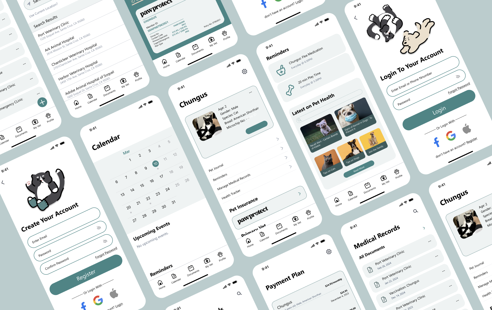
Using the results from our research, we created a user flow for each persona to target their pain points. We focused on the sign up process, uploading medical records/reminders, connecting with your vet, and their pet profile.
By personalizing their pet’s profile during the sign up process, users can get a feel for how the app will prioritize their pet’s health and how it will overall benefit the user.

In the first iteration our main focus was on the onboarding process along with the design of Whisker’s medical record page. Once the low-fi prototype was complete, I asked 4 people to navigate the prototype without guidance and wanted to see…

• If the navigation was intuitive
• If there were features/information missing they would have useful
• How they felt during the process
Positive takeaway
• Testers found the onboarding process easy to navigate and engaging.
• The design and format received positive feedback, indicating a well-received user experience.
Work on
• Participants noted that the homepage felt overcrowded and overwhelming, with too many options for navigation.
• Some testers expressed confusion when transitioning from the homepage to specific tasks, highlighting the need for clearer pathways.
Declutter the Homepage
Based on feedback from testing. I did a side-by-side comparison test with new layout variations. I asked my friends to point out which variation made them feel more excited about using the app and they chose the 3rd iteration layout.
The Nav Bar
I incorrectly assumed that most users would eventually learn the purpose of each page through experience. By accompanying the icons with text, it becomes much easier to navigate for new users.
Easy on the Eyes
With consideration to prioritizing the documents page, it underwent a few redesigns. The call-to-action buttonreformatted for familiarity and easy use. Further iterations were made to prioritize simplicity and thoughtful navigation, ensuring users could easily access their pet's medical records.
Final user testing

A final round of user testing was conducted with 3 new testers to assess the effectiveness of design changes and gather additional feedback.
1. I asked testers to explain their understanding of Whiskers, and had them run through the app to see how they would get from Point A (onboarding) to Point B (uploading a document).
2. I wanted to know if there was anything they found unclear or confusing.
Positive takeaway
• users had a good grasp of Whiskers's purpose
Final screen
Conclusion
Not really the end
The extensive journey of research, testing, and design refinement has culminated in a pet health app that I'm proud to present. However, I recognize there's ample opportunity for enhancement and evolution moving forward.
What I learned
• It's good to ask for lots of help! Having a fresh pair of eyes helped a lot with nitpicking details I glazed over.
• Balancing aesthetics with functionality proved to be a challenge. Selecting the right design elements was crucial in shaping the app's brand identity.
• Settling on a good word choice and typography can be harder than settling on a design choice.
Where we can improve
Moving forward, I aim to enhance my research methods by reaching out to a larger and more diverse audience. Specifically, I would like to focus more on user testing. I would also like to establishing direct connections with veterinary clinics, as it will optimize efficiency for both users and clinics. Our next step is to streamline the process of accessing and managing pet medical information for both parties.
Moving forward
• Fully developing the features of every page and adding interaction.
• Test with more users to see what engages them in other apps and to see what features result in higher user retention.


